


I would be lying if I said today wasn’t a ridiculously exciting day for GoodUnited.
It’s not often you get to introduce a new software platform and a fresh brand direction to support it… but here we are, and sheesh, does it feel good!
So, please allow me to re-introduce ourselves.
Say hello to GoodUnited, the first conversational messaging platform built specifically for nonprofits.
Wait. Is it a refresh or rebrand?
Here we are, playing right into the a-typical expectations of a marketing team, doing a refresh or rebrand or whatever we want to call it.
Usually, I would agree, but here’s the thing about GoodUnited.
It’s a special place. We have a mission to help change the world through partnerships with nonprofits. We are doing that by helping nonprofits meet their supporters where they are.
So, when the marketing and executive leadership team came together over the summer, we all realized that we needed to capture the essence of what we felt was the next evolution of our story - helping nonprofits to take control of social media fundraising and have a clear line of sight into lead and revenue growth.
It’s been 6+ months in the making, and this new version of us is something that our entire team is over-the-moon about.
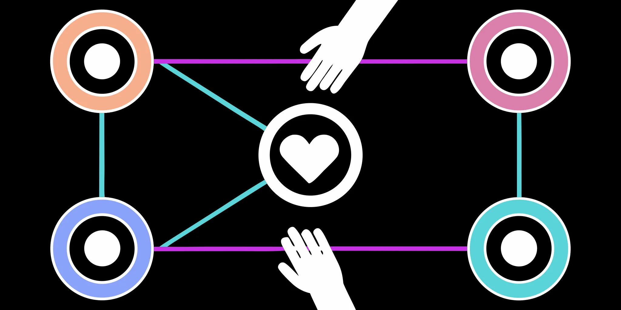
Meet the GoodUnited Conversation Bubble.
Our new logo mark was largely inspired by how we help nonprofits connect with their supporters - through social media messaging platforms.
We incorporated shapes that reinforce the “conversation” - around building relationships with supporters, around personalization at scale, and around the forward-thinkers changing the landscape of individual giving forever; GoodUnited. Not only are the shapes symbolic, but they’re also practical; they are made to stand out against any background.
As an ode to our legacy, the secondary logo keeps the same framework of the current logo, but introduces new colors and patterns to lean heavily into the inventive. It’s minimal yet bold, simple yet memorable, and models exactly what we are doing as a company: leading the way.
Everyone Loves Popsicle Colors.
One of our team’s favorite moments came when we were coming up with colors that embodied the energy, vibes, and overall growth that we wanted our nonprofits to experience when working with us.
We showed our co-founder, Nick, and his immediate response was this:
“These are popsicle colors. I like it.”
Black and white are the primary colors, making a bolder, cleaner statement and ultimately making our brand more timeless.
Then there’s the green. Energetic, fresh, creative, and the embodiment of growth.
The secondary color palette is influenced by the fundamental “CYMK” palette - a subtle nod to technology and the basis of all other colors.

Incorporating hues from across the color wheel to reflect inclusiveness, a fundamental component of GoodUnited as a partner to nonprofits who boast missions across the spectrum of humanity and beyond.
The secondary palette incorporates bright and bold hues. It boasts a subtle juxtaposition of forward momentum (magenta and yellow) with the quiet confidence of a team who’s paving the path in the process (purple and cyan).
These colors together unconsciously evoke feelings of optimism, enthusiasm, and rebellion in viewers. A vibrant reflection of exactly what we’re trying to do: shake things up for the greater good.
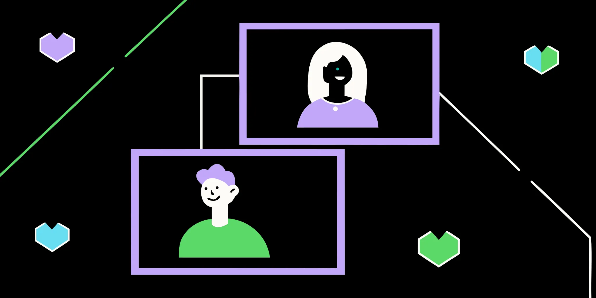
See Ya, Stock Photos.
A big thing that I’ve heard from day one on the job is how much people were unimpressed with the stock images we were using on our old website.
It felt inauthentic, plastic, and ultimately didn’t cut it when thinking about an inclusive, diverse representation of the nonprofits we serve.
Here’s two ways we’re fixing that today:
- We’re using images and photos directly from our nonprofit partners in collaborative pieces like case studies (don’t worry, everything is approved!).
- We’re focusing on adding our own images on our site where it makes sense. Where it’s called for more action-oriented or content-specific images, we’re making intentional decisions to be as diverse and inclusive as possible in the subject matter.

Ditch the Fluff.
At GoodUnited, we’ve walked in both our nonprofit partners’ shoes AND their donors’ shoes.
We know social media fundraising and personalized experiences are relatively new to the fundraising gamut and can become time-consuming without the right tools to help manage the process.
That’s why we speak like the experienced and compassionate business partner we wish we had.
Like a friend that goes waaaaaaay back.
We’re shaping our voice with the following pillars:
- We are writing for all nonprofit professionals (and all readers)
- We look to be concise and specific
- We’re ok with the occasional emoji sneaking in 🤷
- We look to write simply and with positive intent
More Than Colors and Shapes.
We hope this reimagining of our look and feel has you as excited for what’s to come as we are; that it holds true to the past, present, and future of not only GoodUnited, but what we can do when partnered with the nonprofits of the world to help inspire a better tomorrow.
We’re grateful for all the teammates, partners, customers, and community that have helped make GoodUnited an exceptional company over the last seven years.
We can’t wait to see what the future of fundraising has in store… and that first step starts today.